css-in-js
css-in-js 是将 CSS 代码 跟 JS 代码 混合在一起,通过 JS 来动态的生成 CSS 样式,但是这样的话与我们的认知是背道而驰的,正常应该是 CSS JS HTML 分离的,但是由于 CSS 缺乏作用域,所以形成了 css-in-js 这种写法,注意 css-in-js 并不是一种技术,而是一种思想。
优缺点
优点:
- 可以让 CSS 拥有独立的作用域,阻止 CSS 泄露到组件外部,防止冲突。
- 可以动态的生成 CSS 样式,根据组件的状态来动态的生成 CSS 样式。
- CSS-in-JS 可以方便地实现主题切换功能,只需更改主题变量即可改变整个应用的样式。
缺点:
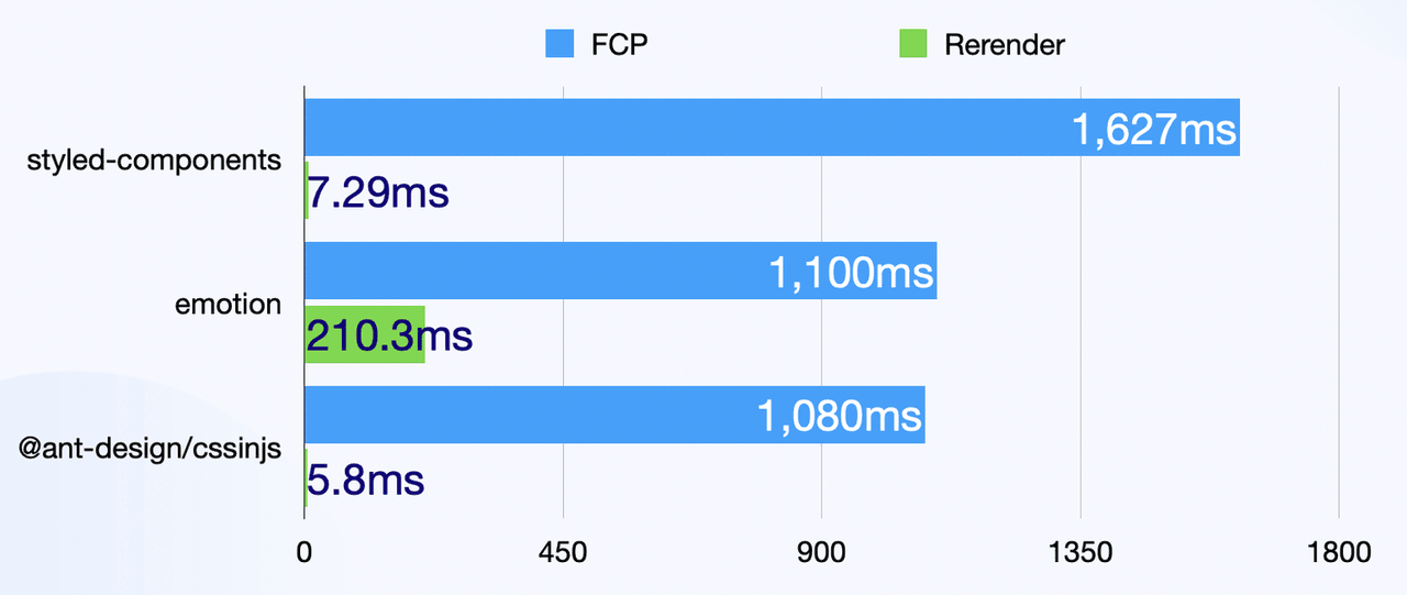
- css-in-js 是基于运行时,所以会损耗一些性能(电脑性能高可以忽略)
- 调试困难,CSS-in-JS 的样式难以调试,因为它们是动态生成的,而不是在 CSS 文件中定义的。
谁在用?
- 最常见的有
Antd用它自研的css-in-js库
css-in-js 库有很多,比如 styled-components、emotion、等等,因为它只是思想,所以很多库都实现了它,但是这些库的实现方式都不一样,所以使用的时候需要根据实际情况选择合适的库,所以 Antd 选择了自研。
案例
我们以 styled-components 为例,来实现一个简单的 css-in-js 案例。
- 安装 styled-components
sh
npm install styled-components- 创建一个
Button组件
tsx
import React from 'react';
import styled from 'styled-components';
const Button = styled.button<{ primary?: boolean }>`
  ${props => (props.primary ? 'background: #6160F2;' : 'background: red;')}
  padding: 10px 20px;
  border-radius: 5px;
  color: white;
  cursor: pointer;
  margin: 10px;
  &:hover {
    color: black;
  }
`;
const App: React.FC = () => {
  return (
    <>
      <Button primary>按钮</Button>
    </>
  );
};

export default App;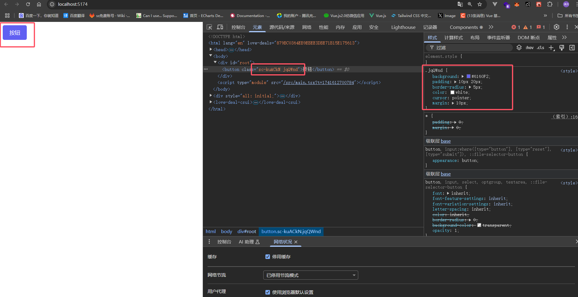
我们可以看到,Button 组件的类名是通过js随机生成的的,这样就避免了类名冲突的问题。
更多用法
继承
我们可以实现一个基础的 Button 组件,然后通过继承来实现更多的按钮样式。
比如例子中的 ButtonBase 组件,然后基于基础样式实现了,BlueButton、FailButton、TextButton 组件,利于我们复用基础样式,以及快速封装组件。
tsx
import React from 'react';
import styled from 'styled-components';
const ButtonBase = styled.button`
  padding: 10px 20px;
  border-radius: 5px;
  color: white;
  cursor: pointer;
  margin: 10px;
  &:hover {
    color: red;
  }
`;

//圆角蓝色按钮
const BlueButton = styled(ButtonBase)`
  background-color: blue;
  border-radius: 20px;
`;
//失败按钮
const FailButton = styled(ButtonBase)`
  background-color: red;
`;
//文字按钮
const TextButton = styled(ButtonBase)`
  background-color: transparent;
  color: blue;
`;
const App: React.FC = () => {
  return (
    <>
      <BlueButton>普通按钮</BlueButton>
      <FailButton>失败按钮</FailButton>
      <TextButton>文字按钮</TextButton>
    </>
  );
};

export default App;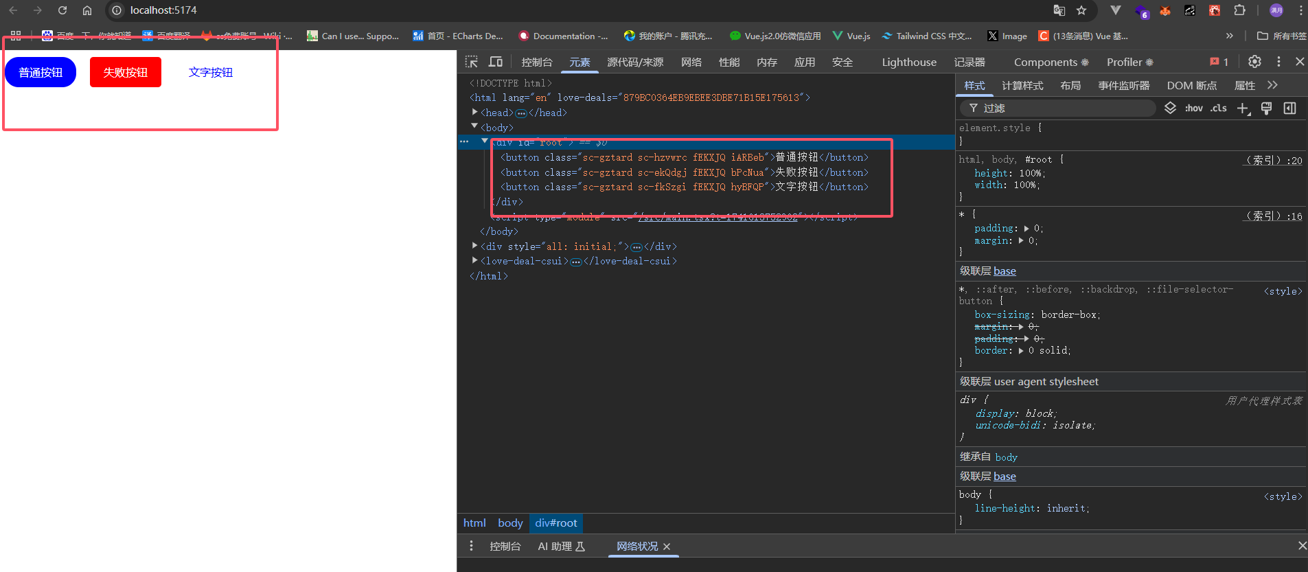
属性
我们可以通过 attrs 来给组件添加属性,比如 defaultValue,然后通过 props 来获取属性值。
tsx
import React from 'react';
import styled from 'styled-components';
interface DivComponentProps {
  defaultValue: string;
}
const InputComponent = styled.input.attrs<DivComponentProps>(props => ({
  type: 'text',
  defaultValue: props.defaultValue,
}))`
  border: 1px solid blue;
  margin: 20px;
`;

const App: React.FC = () => {
  const defaultValue = '小满zs';
  return (
    <>
      <InputComponent defaultValue={defaultValue}></InputComponent>
    </>
  );
};

export default App;全局样式
我们可以通过 createGlobalStyle 来创建全局样式, 然后放到 App 组件中。
tsx
import React from 'react';
import styled, { createGlobalStyle } from 'styled-components';
const GlobalStyle = createGlobalStyle`
  body {
    background-color: #f0f0f0;
  },
  * {
    margin: 0;
    padding: 0;
    box-sizing: border-box;
  }
  ul,ol{
      list-style: none;
  }
`;
const App: React.FC = () => {
  return (
    <>
      <GlobalStyle />
    </>
  );
};

export default App;动画
我们可以通过 keyframes 来创建动画。
tsx
import React from 'react';
import styled, { createGlobalStyle, keyframes } from 'styled-components';

const move = keyframes`
  0%{
    transform: translateX(0);
  }
  100%{
    transform: translateX(100px);
  }
`;
const Box = styled.div`
  width: 100px;
  height: 100px;
  background-color: red;
  animation: ${move} 1s linear infinite;
`;
const App: React.FC = () => {
  return (
    <>
      <Box></Box>
    </>
  );
};

export default App;原理剖析
这个技术叫标签模板, 是 ES6 新增的特性,它可以紧跟在函数后面,该函数将被用来调用这个字符串模板
调用完成之后,这个函数的第一个参数是模板字符串的静态字符串,从第二个参数开始,是模板字符串中变量值,也就是${}里面的值
strArr:['\n color:red;\n width:', 'px;\n height:', 'px;\n', raw: Array(3)]args:[30, 50]
ts
const div = function (strArr: TemplateStringsArray, ...args: any[]) {
  return strArr.reduce((result, str, i) => {
    return result + str + (args[i] || '');
  }, '');
};

const a = div`
  color:red;
  width:${30}px;
  height:${50}px;
`;
console.log(a);
//  输出结果
//  color:red;
//  width:30px;
//  height:50px;